Analytics Reports provide users with a comprehensive view of network resource utilization. Top N Ports Reports can be configured to show network utilization over different time periods (e.g., daily, hourly, monthly), and show trends in network utilization over those time periods. The Top N Ports Report can also provide predictive analytics to show expected future usage. Other reports can provide a "real-time" view of all discovered network switches (e.g., Network Availability, Alarms). The following reports can be created:
Note:To generate a Top N Ports Utilization, Top N PoE Ports Utilization, or Top N PoE Switches Report, you must first create an Analytics Profile using the Profile Screen that defines the switches/ports that you want to view and the type of information that you want to view on those switches/ports. Data will only be gathered and displayed for those switches/ports included in the profile. You do not need to create a profile for Network Availability, Alarms, or Network Health, Reports. These reports simply show real-time information for all discovered switches.
The sections below describe the different report options and basic behavior for all reports. The report options vary depending on the report type (e.g., Top N Applications, Network Health). Specific views/options are detailed in the help pages for each report type. Click on a link above to view specific instructions for each report type.
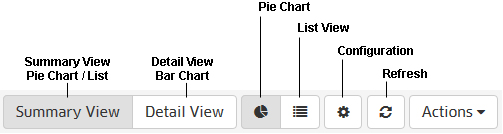
Analytics Reports can be viewed in different formats (e.g., pie chart, bar chart). You can also configure a custom view to change the amount of information displayed (e.g., the number of Applications/Clients displayed), as well as the timeframe that you want to view (e.g., last 24 hours, last 7 days). You can also view data trends by "drilling down" in a Detailed Report. You can also print a report or download a report in PDF or PNG format, and even include the data as part of a scheduled report that is automatically generated in the Report Application. These options can be configured using the Options Bar (shown below) displayed at the top of every report.
By default, the Summary View is initially displayed for all reports. This may be displayed graphically as a pie chart (e.g., Top N Applications, Top N Ports Utilization) or in a list (e.g., Network Health). The Detail View displays a detailed subset of the information in a bar chart format. While in the Detail View, you can also display an even more detailed subset of the data to view data trends. For example, if a Summary View is displaying data for the last week, the Detail view will display data for each day of the last week; and clicking on a day in the Detail view chart will display data for each hour of that day, enabling you to view hourly data trends.
For "Top N" Reports (e.g., Top N Applications, Top N Clients), you can configure the amount of data displayed and the time period you want to view. You can set the number of "top" (in terms of utilization) applications, clients, or switches you want in the display. For example, you might want to see the top 10 applications displayed in a Top N Applications Report; or the top 20 ports displayed in a Top N Ports Utilization Report. You can also configure the time period to display (last 24 hours, last 7 days, last 4 weeks).
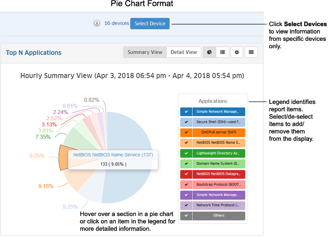
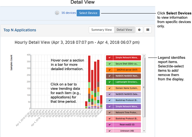
The chart legend to the right of each display labels each item in the chart by color and text. By default, information from all switches/ports for a Report is displayed. The number of entities displayed in the legend and the chart depends of the number you configure for the profile (e.g., top 10, top 20). However, there are view options that you can use to view information for specific switches/ports:
Note: You may notice a category labeled "Others" in "Top N" Reports. Remember, only the "top" applications, clients, or switches as determined by the profile (top 10, top 20) are displayed. There may be many others in the profile that are not in the "top" 10 or 20. The "Others" category gives you an idea of all of the other applications, clients, or switches in the profile with low utilization rates that do not qualify as a "top" application, client, or switch.
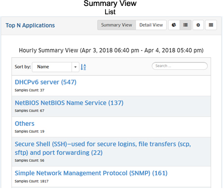
The Summary View displays information either in pie chart format, with each entity (e.g., application, client) displayed at a percentage of the total for the configured time period (e.g., 24 hours); or in list format, with each entity listed from highest to lowest. By default, data for the past 24 hours is shown. However, you can change the timeframe, as well as the number of entities displayed (top applications, top ports). The examples below show an Hourly Summary View for the Top N Applications Report.
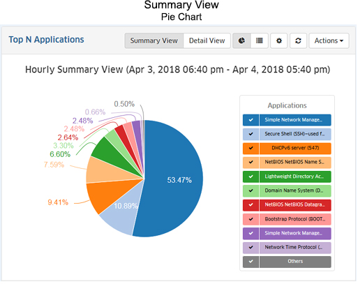
The Pie Chart Format displays information in a pie chart with each entity displayed as a percentage of the total. The legend identifies each item in the chart by color and text. For example, the legend in a Top N Applications Report (shown below) identifies the applications displayed in the pie chart. (The legend in a Top N Ports Utilization Report would identify the switches/ports displayed.) You can hover over a section of the chart (or click on an item in the legend) to view detailed information for that section. For example, in the Top N Applications pie chart below, you could hover over an application in the chart to view the number of flows from that application. You can also click select/deselect an item in the legend to add/remove the item from the display.
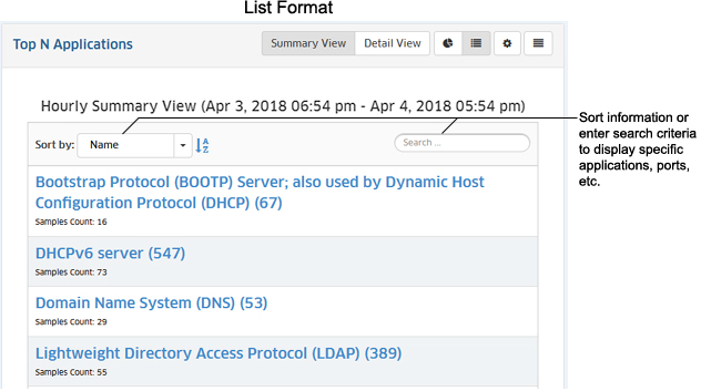
The List Format displays information in list form (e.g., a list of Switches, Applications, or Users displayed from highest to lowest). You can sort the display by specific criteria (e.g., name), sort in ascending/descending order by, or search for and display specific information (e.g., display only a specific application or port number). The example below shows a Top N Applications Report.
The Detail View displays a detailed subset of the information in bar chart format for the configured time period. For example, if a report is configured to show data for the last 24 hours, the bar chart view would display data for each hour over those 24 hours. The legend identifies each item in the chart by color and text. For example, the legend in a Top N Applications Report (shown below) identifies the applications displayed in the bar chart. (The legend in a Top N Ports Utilization Report would identify the switches/ports displayed.) You can hover over an area in a bar to view detailed information for that item. For example, in the Top N Applications bar chart below, you could hover over an area in a bar to view the number of flows from that application. Or you can click on an item in the legend to isolate the item in the display and show the same detailed information. You can also click select/deselect an item in the legend to add/remove the items from the display. You can also view data trends by "drilling down" on a data set to see a subset of that data.
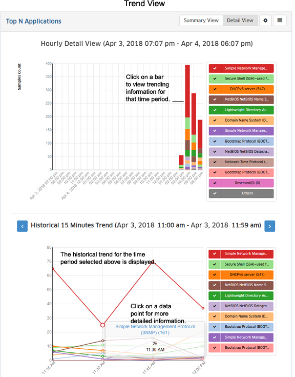
You can view data trends by "drilling down" on a data set to see a subset of that data. Click on a bar in the chart to view the data trend for that selection. For example, if you selected one of the bars in an Hourly Detail View, the trend for that hour would be displayed in 15 minute increments (as shown below). (If you selected one of the bars in a Daily Detail View, the trend for that hour would be displayed in one-hour increments.) You can scroll forward or back through the trending date using the arrows at the top of the chart.
Depending on the timeframe in the chart (e.g., Monthly, Weekly), data trend subsets are displayed as follows:
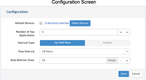
You can configure the report view by clicking on the Configuration icon and customizing the display. The Configuration Screen for the Top N Applications Report is shown below. The configuration options vary depending on the report type. Specific field descriptions are defined in the help pages for each report type. Once you update any options and click on the Save button, reports will be displayed in the new format.
You can download a report in PDF or PNG format or send the report to a printer by clicking on the Actions button in the Options Bar and making a selection from the drop-down menu (Download PNG Image/Download PDF Document/Print Image).
You can add the current report view to a Report that you create in the Report Application by clicking on the Actions button in the Options Bar and selecting Add to Report. The Report Application enables you to create and schedule Analytics Reports that can be viewed and stored as PDF documents. This way, in addition to real-time viewing of Analytics Reports in the Analytics Application, you can automatically generate and store Analytics Reports that you can view at any time. See the Report Configuration Help for more information.