The Analytics Top N Applications - Advanced Report Screen displays information about the top applications being accessed on the network based on Signature Profiles configured in the Application Visibility Application. Signature Profiles include the specific application groups/applications being monitored as well as the specific switches being monitored, so the information displayed is determined by the applications and switches included in the profile. Only information for those applications and switches is displayed. By default, the Summary View is displayed (pie chart) with each application displayed as a percentage of the total for the configured time interval (e.g., last 24 hours). The information can be displayed in different formats, and you can also configure the type and amount of information displayed.
Note: Report Views and configuration options are configured using the Options Bar located at the top of the report. This help page contains view and configuration information specific to Top N Applications - Advanced Reports. For specific information on all of the options available, see the "Report Options" section of the Analytics Reports Help.
Signature Profiles are created in the Application Visibility Application. When you click on the Top N Applications - Advanced link, you have the option to select the type of information you want to display (App Flow Count or App Bandwidth Usage). You can also select to view information for all switches in a type, or select specific switches.
The App Flow Count view displays traffic flow information for applications/application groups discovered on the network, and the percentage of network resources being used by each application for the selected switches and configured time period. Select a display option to display data as described below: All 6860s/APs, Tabular View, Manually Select Devices.
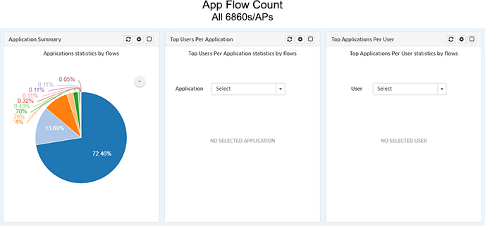
Select "For All 6860s/APs" to display the information for all devices in the profile in Pie Chart Format. Three reports (shown below) are available. The first report chart automatically displays the Application Summary, with each application displayed as a percentage of the total traffic for the devices. The second report is used to display the Top Users Per Application. And the third report is used to display the Top Applications Per User. Note that if there is not enough room on the screen, the reports are displayed vertically. Scroll down to view each report.
Note:"Top Users Per Application" and "Top Applications Per User Reports" are supported on AOS devices and APs (AWOS 3.0.6x and higher).
At the top of each display, you can click on the Refresh button to refresh the data, the Configuration button to configure the report, or the Maximize button to for a full screen display. Click on the Down Arrow to display a legend for the chart.
Note: When you are in full screen display for any of the above pie charts, you can click click on the List View or Tabular View buttons to change the display.
The Application Summary Report automatically displays application flow statistics for selected devices as a pie chart, with each application displayed as a percentage of the total traffic for the selected devices. Click on the Down Arrow to display a legend for the chart. By default, an Hourly Summary Report is displayed, showing a summary of the data over the last 24 hours. However, you can configure the report to display different time intervals (e.g., last 24 hours, last 7 days). The legend on the right of the screen identifies each application in the chart by color and text. You can hover over a section of the chart to view detailed information for that section. Or you can click on an application in the legend to isolate the item in the display and show the same detailed information. You can also click select/deselect an application(s) in the legend to add/remove the application(s) from the display.
The Top Users per Application Report displays the top users (IP address) for the selected application. As shown above, no data is initially displayed. Select an application from the Application drop-down menu to display the top users for the selected application. Click on the Down Arrow to display a legend for the chart.
The Top Applications per User Report displays the top applications for the selected user (IP address). As shown above, no data is initially displayed. Select a user (IP address) from the User drop-down menu to display the top application for the selected user. Click on the Down Arrow to display a legend for the chart.
Select "Tabular Views" to view data in a table format. The "By Source" tab displays flow data by the source (client) generating the flows. The "By Device" tab displays flow data with the switch to which the source (client) generating the flows was connected. By default, all flow data in the database is displayed for all devices. You can enter search criteria in the Search Bar to search for specific information; or you can click on the Filter Bar to filter the table to display specific information. You can also click on the View Bandwidth Usage button to view application bandwidth usage in tabular format.
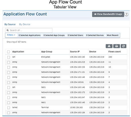
Note: OmniVista begins collecting flow records as soon as a profile is assigned to a device. OmniVista can store up 20,000 records, at which point the data is overwritten with new records.
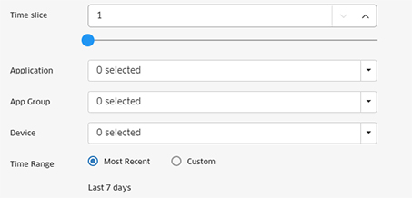
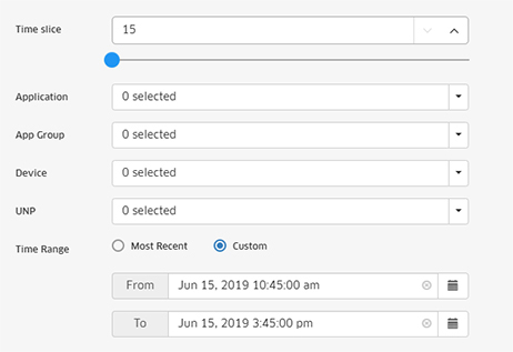
Click on the Filter Bar at the top of the table to bring up the Filter Options Screen. Complete the fields to filter the table view and click on the X in the upper-right corner of the screen to close the screen and view the filtered table. The available filters vary depending on whether you are viewing the table in "By Device" or "By Source" view. The screen below shows the filters available for "Device" view.
Select "Manually Select Devices" and click on the Select Devices button to view data for specific devices. The data displays and viewing options are the same as those available in the All 6860s/APs option.
The App Bandwidth Usage view displays packet/byte count information for applications/application groups discovered on the network, and the percentage of network resources being used by each application for the selected switches and configured time period. Select a display option to display data as described below: All Devices, Tabular View, Manually Select Devices.
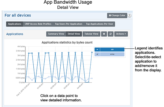
Select "For All Devices" to display the information for all devices in the profile in Pie Chart Format. By default, App Bandwidth Usage Reports are displayed in Summary View as a pie chart (packet count), with each application displayed as a percentage of the total traffic for the selected switches. By default, an Hourly Summary Report is displayed, showing a summary of the data over the last 24 hours. However, you can configure the report to display different time intervals (e.g., last 24 hours, last 7 days). The legend on the right of the screen identifies each application in the chart by color and text. You can hover over a section of the chart to view detailed information for that section. Or you can click on an application in the legend to isolate the item in the display and show the same detailed information. You can also click select/deselect an application(s) in the legend to add/remove the application(s) from the display. You can also display information in a detailed line graph by clicking on the Detail View button at the top of the screen. view.
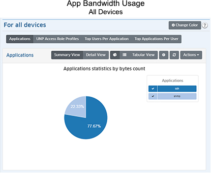
Four reports (shown below) are available. The first report chart (Applications) automatically displays data, with each application displayed as a percentage of the total traffic for all devices. The second report (UNP Access Role Profiles) displays application information by UNP Access Role Profile. The third report displays the Top Users Per Application. And the fourth report displays the Top Applications Per User.
The Application Summary Report automatically displays application flow statistics for selected devices as a pie chart, with each application displayed as a percentage of the total traffic for the selected devices. Click on the Down Arrow to display a legend for the chart. By default, an Hourly Summary Report is displayed, showing a summary of the data over the last 24 hours. However, you can configure the report to display different time intervals (e.g., last 24 hours, last 7 days). The legend on the right of the screen identifies each application in the chart by color and text. You can hover over a section of the chart to view detailed information for that section. Or you can click on an application in the legend to isolate the item in the display and show the same detailed information. You can also click select/deselect an application(s) in the legend to add/remove the application(s) from the display.
The UNP Access Role Profile Report displays application information by UNP Access Role Profile. Configured UNPs are displayed in the legend to the right.
The Top Users per Application Report displays the top users (IP address) for the selected application. Select an application from the Application drop-down menu to display the top users for the selected application. Click on the Down Arrow to display a legend for the chart.
The Top Applications per User Report displays the top applications for the selected user (IP address). Select a user (IP address) from the User drop-down menu to display the top application for the selected user. Click on the Down Arrow to display a legend for the chart.
The Detail View displays detailed data in a line chart for the configured time period. Click on a data point for detailed information. As in the Pie Chart view, the legend on the right of the screen identifies each application in the chart by color and text. And you can also click select/deselect an application(s) in the legend to add/remove the application(s) from the display.
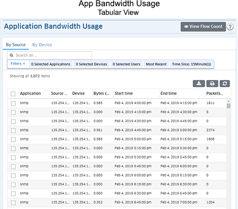
Select "Tabular Views" to view data in a table format. The "By Source" tab displays flow data by the source (client) generating the flows. The "By Device" tab displays flow data with the switch to which the source (client) generating the flows was connected. By default, all flow data in the database is displayed for all devices. You can enter search criteria in the Search Bar to search for specific information; or you can click on the Filter Bar to filter the table to display specific information. You can also click on the View Flow Count button to view application flow data in tabular format.
 .
.Click on the Filter Bar at the top of the table to bring up the Filter Options Screen. Complete the fields to filter the table view and click on the X in the upper-right corner of the screen to close the screen and view the filtered table. The available filters vary depending on whether you are viewing the table in "By Device" or "By Source" view. The screen below shows the filters available for "Device" view.
Select "Manually Select Devices" and click on the Select Devices button to view data for specific devices. The data displays and viewing options are the same as those available in the All Devices option.
You can configure the amount and type of information displayed (e.g., the number of applications displayed, byte or packet information) as well as the time interval that you want to view. To configure the report display, click on the Configuration icon in the upper-right corner of the report to bring up the Configuration Screen, then complete the fields as described in the following sections. The available options vary depending on the view (e.g., App Flow Count, App Bandwidth Usage, Packet Count, Byte Count).
Note: For App Flow Count - Top Users per Application or Top Applications per User Reports, if any of the reporting device OS's are lower than AOS 8.5R4/AWOS 3.0.6.x, the "Time Period Type" field will not be displayed.
When you are done, click the Apply button. The report display will immediately change to the new view. This will remain the view until it is changed again.
Note: You can change the display colors in a report by clicking on the Change Color button at the top of the report. The currently-displayed colors are shown. Click on a color to change it. When you are finished, click OK. Wherever that color is displayed in the report (and legend), it will be displayed in the new color. Click on the Restore Default Colors button to return all colors to the default settings.